Charlotte Chevalier Sound Business Forms — Charlotte Chevalier

Client

Sound Business Forms

Team

Creative Director: Holly Robins, Development: Tyler Rilling

My Role

Lead Designer, Branding, Logo Design, Icon Design, Wireframing, UI Design

Tools

Illustrator, Sketch, Wordpress, Photoshop

Summary

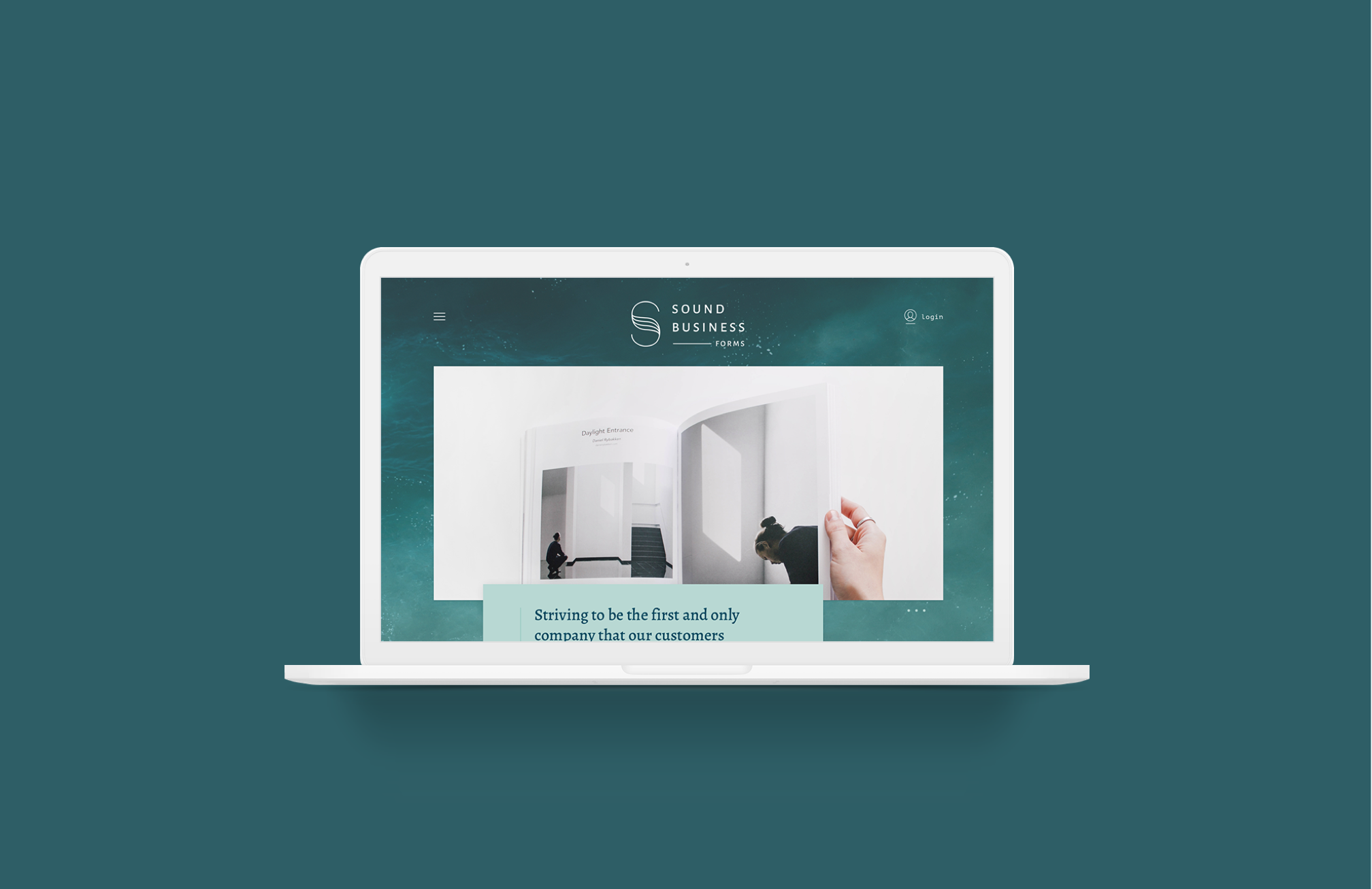
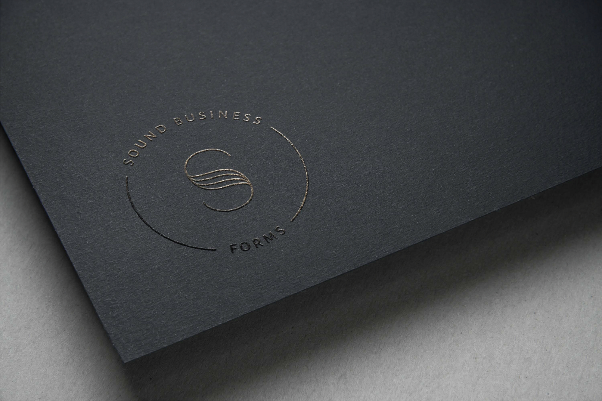
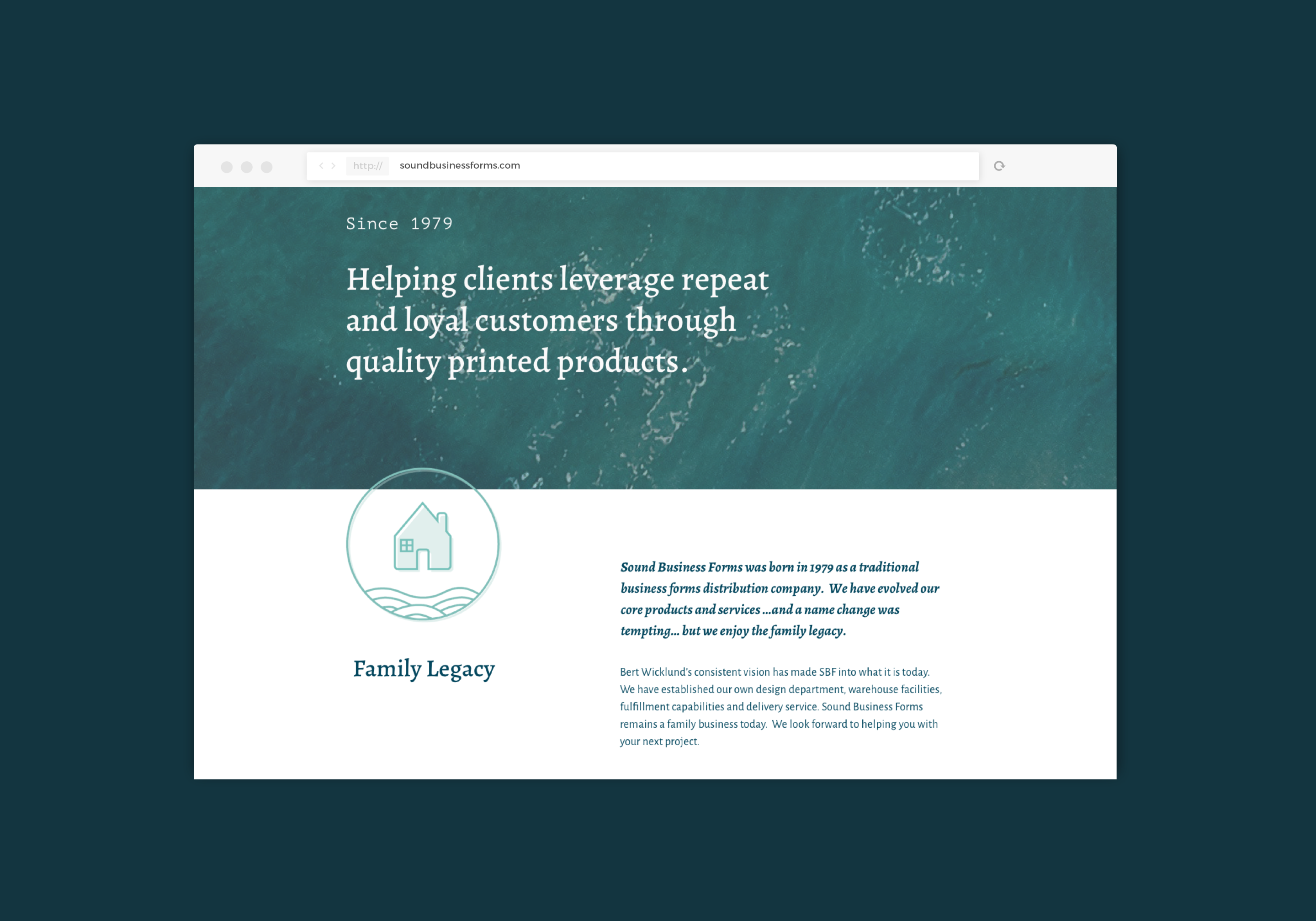
Sound Business Forms has over 35 years of experience connecting their clients with their audience in new and exciting ways – striving to be the first and only company their customers think of for all their printing needs. As a smaller, local company based out of Seattle, SBF came to Wildern with a need to rebrand and redo their website. Their excellent quality of service and product was not accurately represented in their digital presence.

Work done at Wildern Design + Interactive.
© Wildern Design + Interactive.
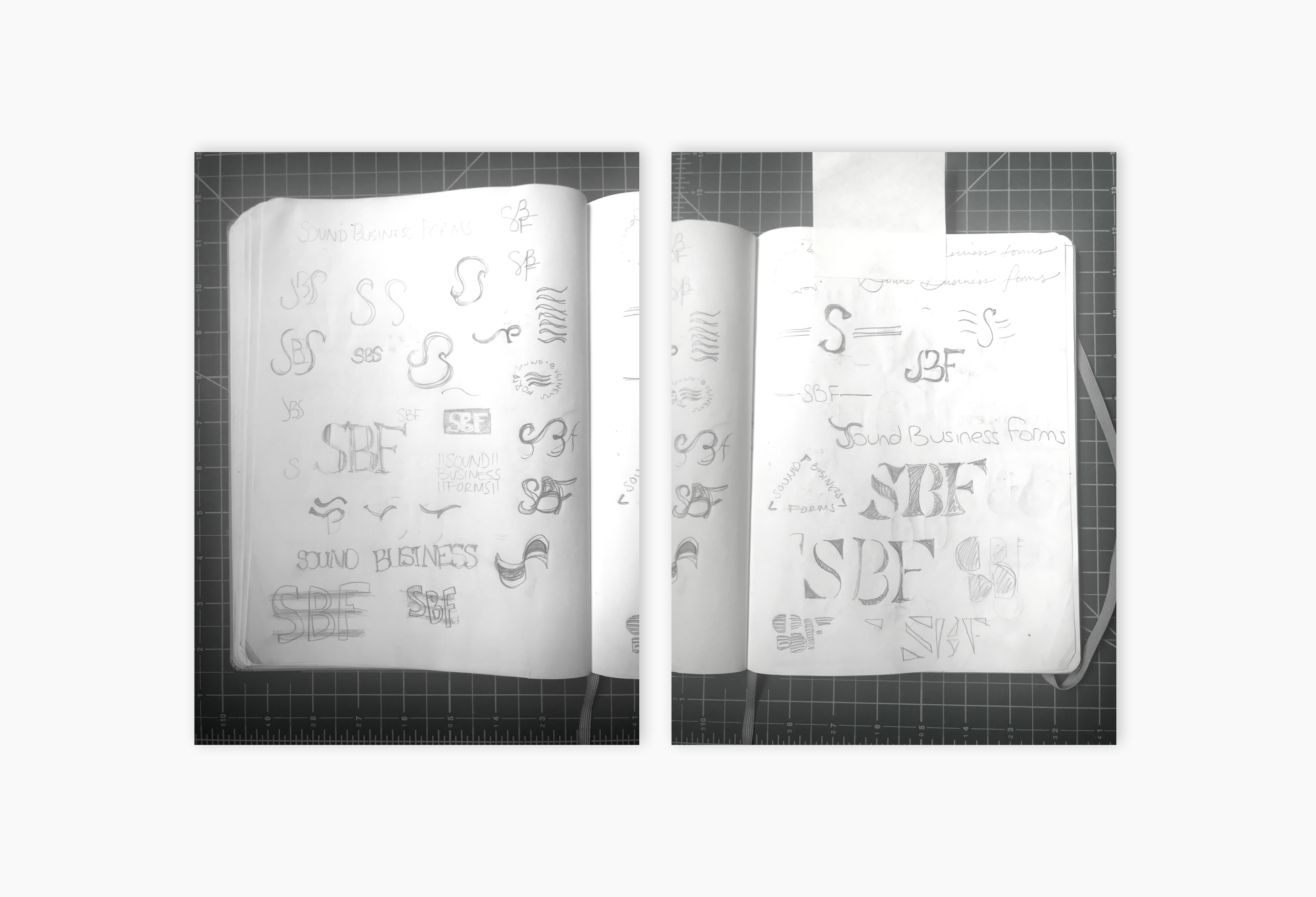
 

Early logo sketches

Challenge

Working with a client whose business is very personal to them, I had to be mindful of honoring the equity they had already built in their brand. Their previous website was not only difficult to navigate, but it was a challenge to discover their story and the work they create. My challenge was to build a product that accurately represented them as a family business, gave them the control to showcase current work, and gave them the flexibility to display a variety of work.

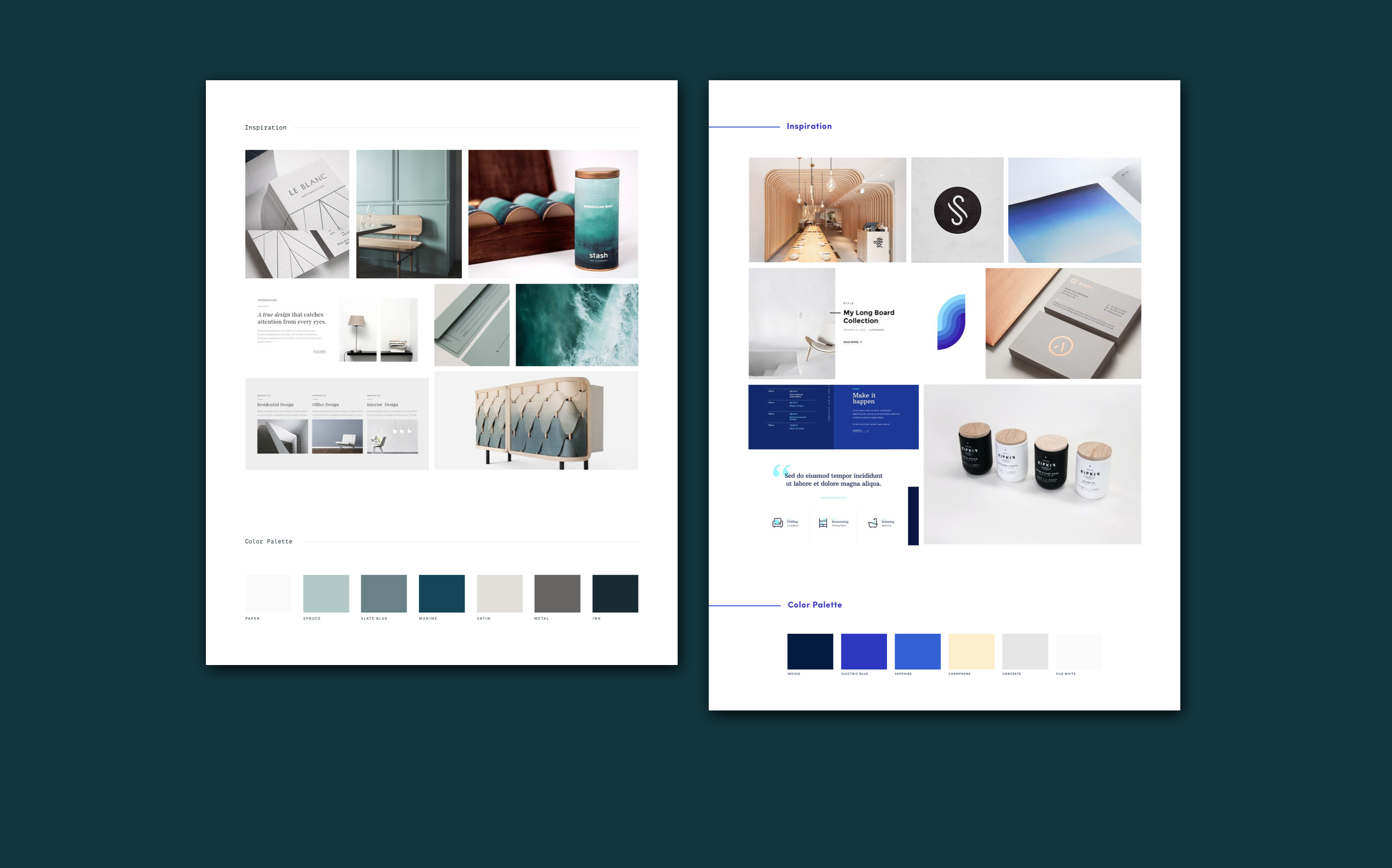
Two brand concepts presented to SBF

Branding

I thought it would be fun to present a safe choice along with a bold brand to choose from. The adventurous choice takes the Pacific Northwest ocean inspiration in a modern direction, with a bright gradient, modern sans serif, cool grays, and a touch of golden warmth to round it all out. The client chose the safer, more elegant direction, which really leans into the paper feel representing the quality print work they provide – through layering, texture, and a modern serif.

Wireframe Solutions

With the wireframes, there were several solutions I provided to the client: created a landing page, improved the form process for new and returning customers, displayed their work in categories, and created a testimonial section for their story page. The wirefames in this project were not only a tool to communicate functionality but also served as a guide for the client to produce the best content possible.

I designed a basic landing page for SBF to showcase their main message, story, services, and work all in an easily digestible format. The customer coming to their site now will be able to access their contact information from the menu, on every page, and in the footer.

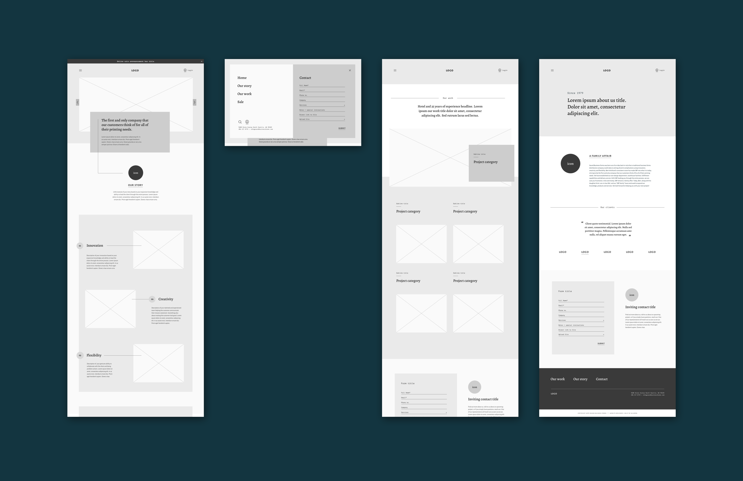
Wireframes presented to SBF

Iconography

I suggested the use of illustrative iconography to pull the content together and bring in that personal touch Sound Business Forms brings to every client. These playful and elegant icons bring a few of their brand values: inviting, thoughtful, genuine, and detailed. It is also an element that sets them apart from their competitors.

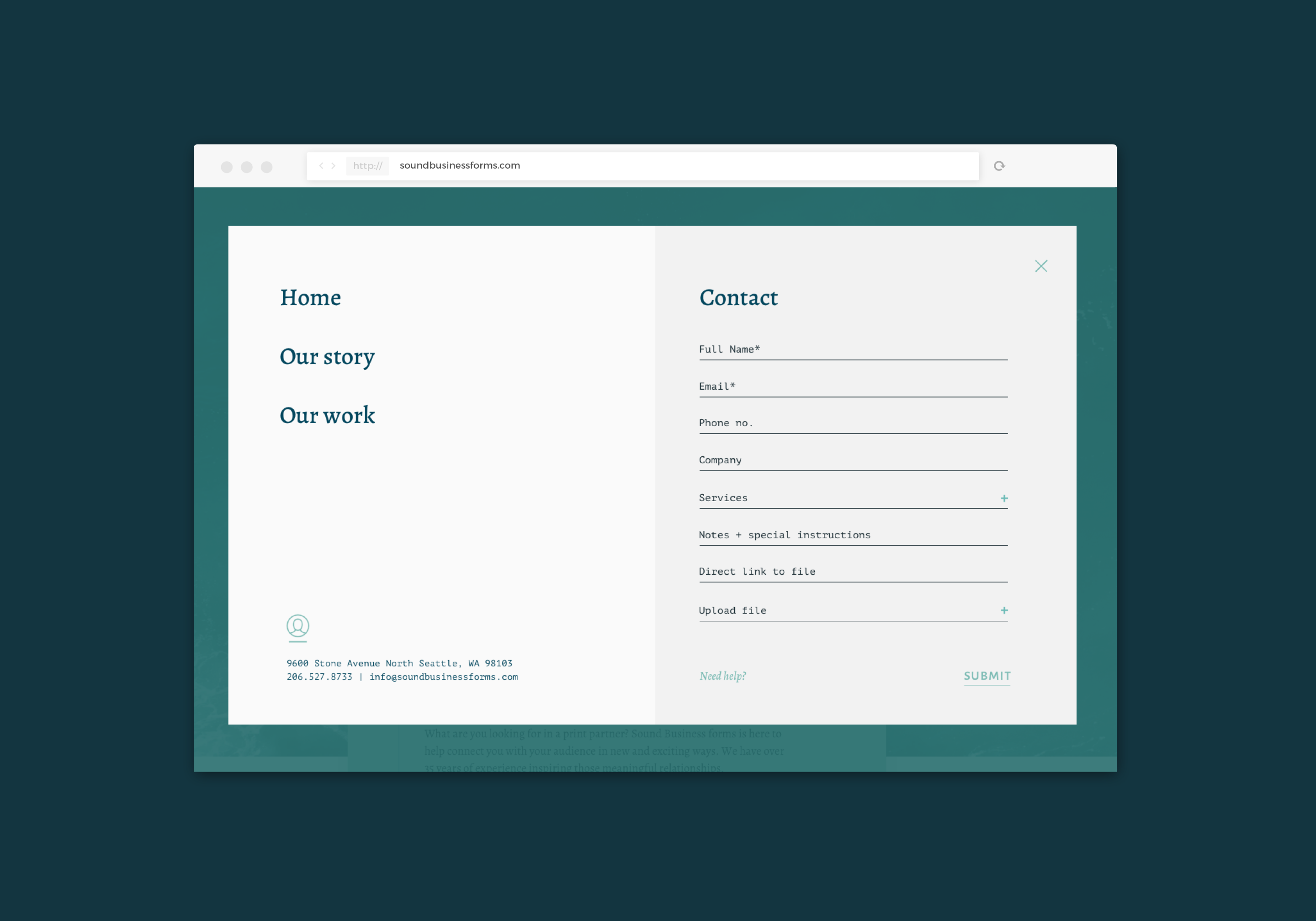
Modern overlay menu + contact form

Full-screen Navigation Menu
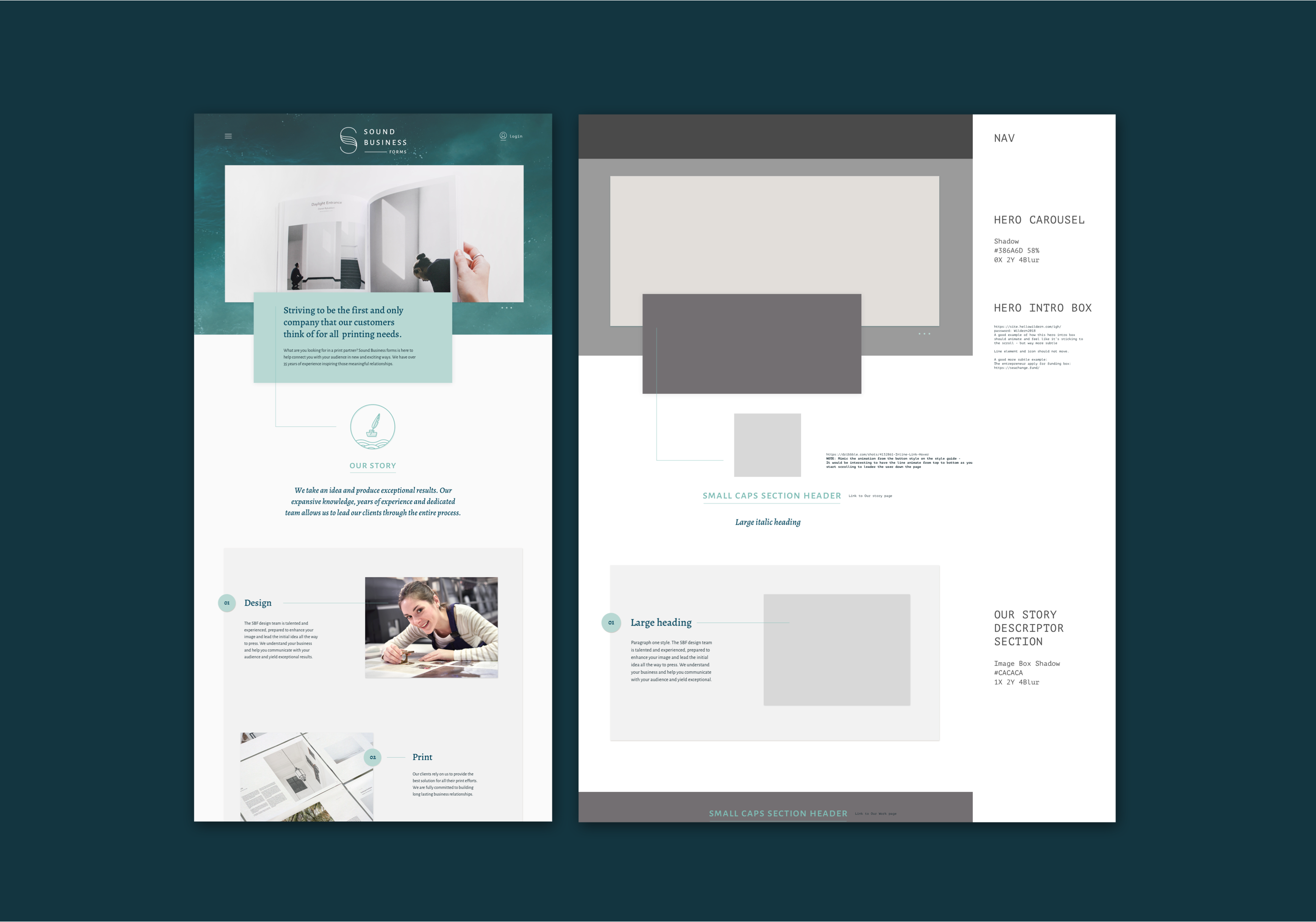
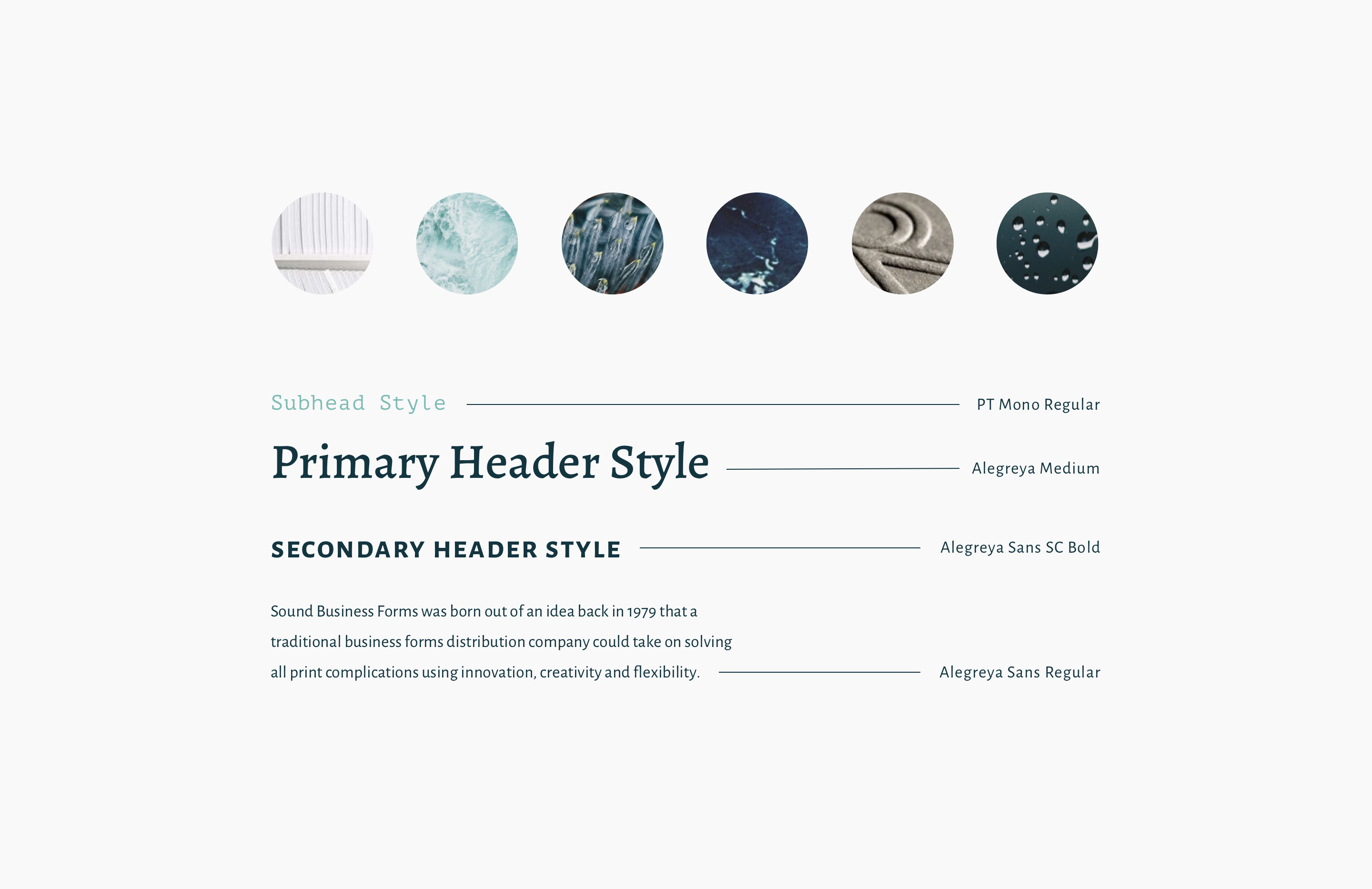
Knowing that there are both new and returning clients coming to their website, I wanted to easily separate out the main navigation from the users returning to quickly login. The main navigation is the hamburger menu, logo, and login button. To bring Sound Business Forms into the modern era, I designed a full-screen navigation menu that elegantly appears from a “hamburger” button. This seamless menu navigation occupies the entire screen, highlights the main navigation links with typographical hierarchy, and makes the contact form easy to use and quick to find, especially on mobile. The semi-transparent overlay allows the user to have the ability to view the page underneath.


Dev style guide

Development Style Guide

In order to streamline our development process, I created a style guide for our development team. This made our process more efficient and reduced the amount of back and forth with questions like: what is your grid? how does this scale? what happens with error states? how does this work? This process encouraged consistency with our vision and also allowed the development team to focus on building the most efficient custom site.

Reflection

In reflection, the look and feel of the website would have been further enhanced if Wildern had had the opportunity to design and build the work mockups from the client. As a designer, I have come to learn that assets from the clients are not always cohesive with the designs and would have come up with a more flexible solution to accommodate the varying styles of content.

Top