
For the last 3 weeks in our user experience class, we have been redesigning non-profit websites. Most organizations do not have the cashflow to finance a website, and social media and design are usually an afterthought. I decided to go with the Northwest Film Forum because not only did their site need a lot of help, but they are also a key organization supporting local artists to pursue their dreams, as well as deepen public appreciation of film as an art form by exhibiting historical film; influential world, national and local cinema.
Below, you can see the audit for their homepage:

They clearly need help! Readability is definitely an issue, the overall feel of the website feels as if it is stuck in the 90s, and the color palette is off. The content is off-center, which makes me tick! The whole website feels as if I am reading a giant encyclopedia of information I have to cycle through in order to get to the content I want. Oh yeah, and it’s not responsive.
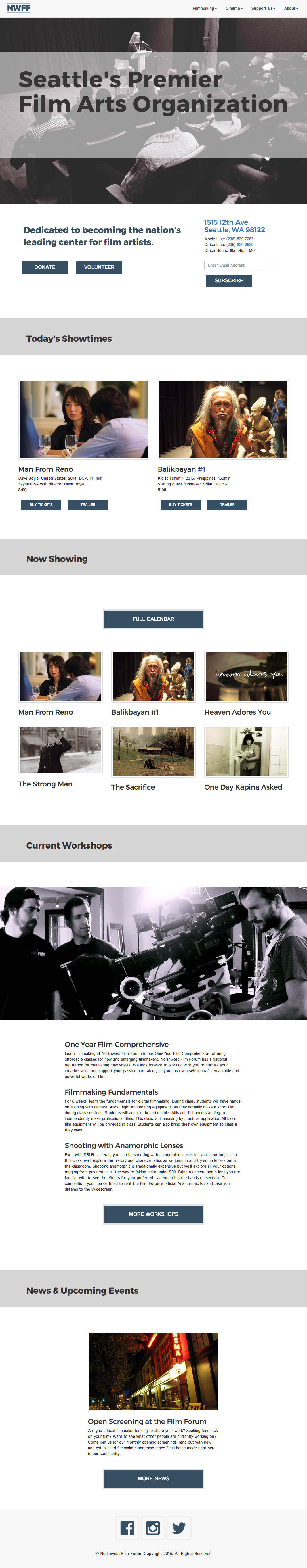
I found that users visiting this site would be coming either to find what was current and upcoming, for filmmaking purposes (whether to access grants, workshops, etc…), or to be more involved in supporting this fine organization.

I had to work out the content thinking about mobile first. If you were walking around, on your phone and checking the website, you would want the address, phone numbers, and that day’s showtimes. Then you would scroll down and find snippets of each other 4 categories, stacked in a one column grid, which would then expand to desktop and have more information.

Here is my initial style tile:

I decided to forgo the logo and the red, and go with a subdued color palette which made me feel of film. Grays, blues and purplish grays, as well as a much simplified logo. I learned how to use bootstrap 3 as well as fontawesome! Here is a screenshot of the website:
