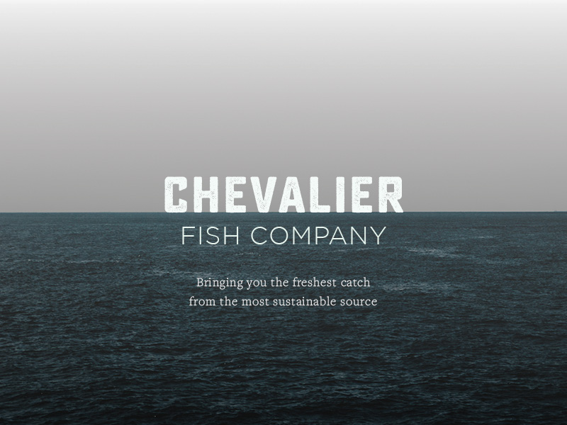
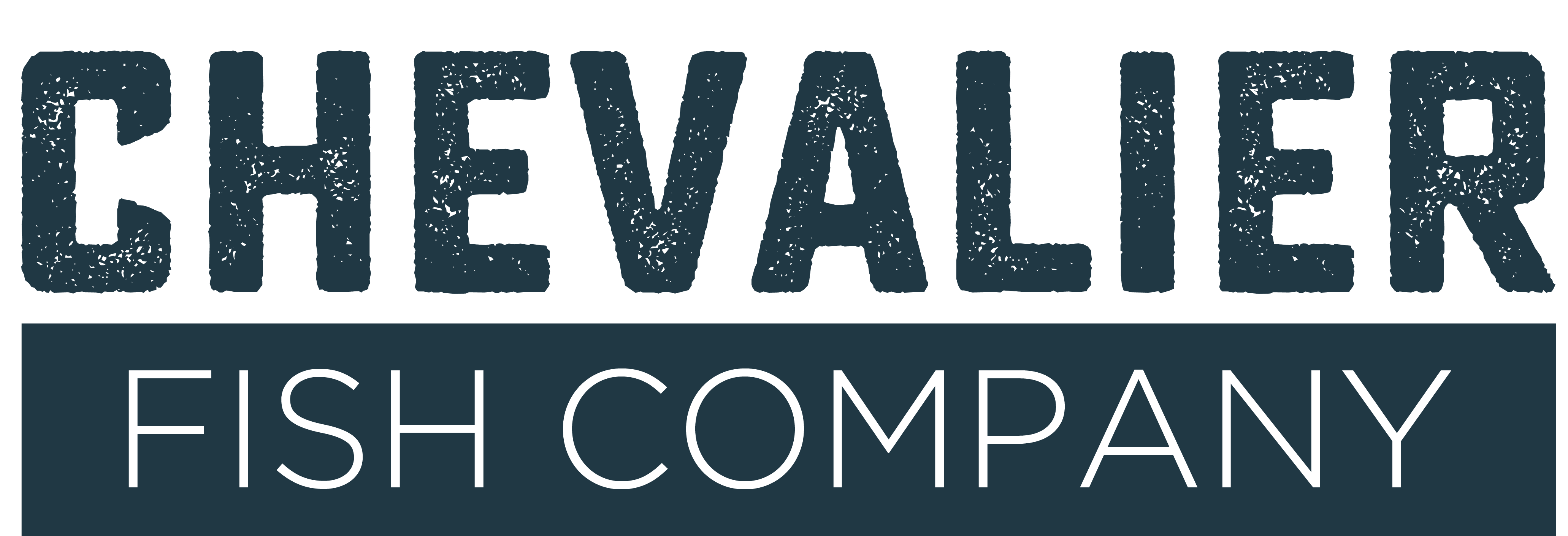
After receiving feedback from classmates, I decided against developing a separate logo mark. The typeface chosen evokes the rawness and heritage of the brand, resembling word-heavy logos made before the mid century. In most cases the logo will be written out as such:
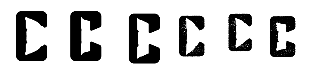
I am currently working on adapting the letter ‘C’ in Chevalier slightly, if there was ever a need for the logo to be small, for example on packaging as a stamp. On the website and in the video, the full logo will exist.
Here are some preliminary sketches: