
The Assignment
Design the packaging for a pseudo company called Sitka Sound Botanicals. The product: “By the Sea” bath salts. Assignment requirements: use two typefaces and experiment with typographical layout, grouping, and hierarchy.
The Message
- Handmade
- Small-batch personality
- Looking to expand
- Made in Sitka, Alaska
- Wild-crafted herbs & organic
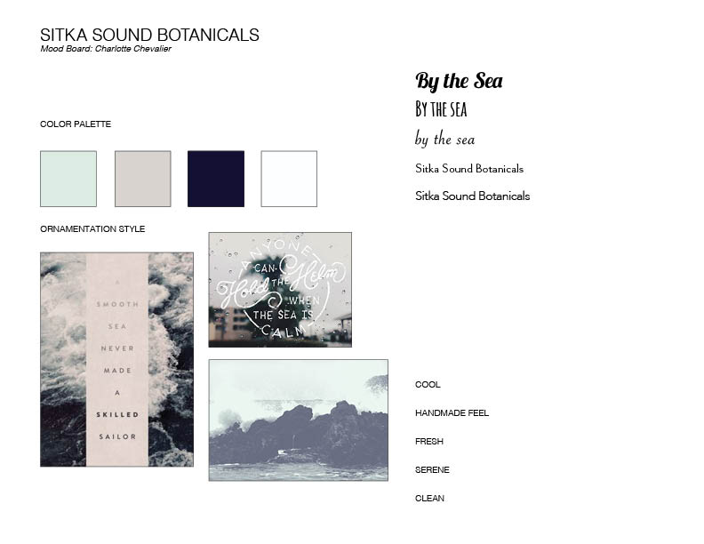
Moodboard

I decided to experiment with hand lettering in order to evoke the handmade feel. I started out by sketching with a pencil to get the look I wanted, as well as tracing paper to get the letters just right. The sharpness of the pencil allowed me to get the rhythm of the letters, as well as the sharpness I was looking for. I wanted to evoke a sketch-like feeling, almost a signature.


Next I scanned in my sketches, vectorized them and experimented with grouping. I started off with the name of the company as well the product. I was thinking about some sort of seal or stamp, which is where the circle comes in. I also noticed that the even, thick stroke of the hand lettering didn’t transfer well digitally.


Simultaneously I also sketched out some rough ideas for hierarchy and grouping. We were given an ample amount of copy to work with, which proved to be difficult. Once we presented our sketches in critique, I had a much better understanding of what makes for successful grouping:
- Negative space
- Font weight & font size
- Alignment
- Creating a focal point or emphasis
- Color

Finally, I had to adjust the vectorized lettering. Thankfully we had a talented guest speaker come in a teach us a couple of tricks. I retraced my vector letters, keeping mind plotting points, as well as keeping the handle bars perpendicular.
