Charlotte Chevalier Kastner — Charlotte Chevalier

Client

Williams Kastner

Team

Creative Director: Holly Torneby, Development: Marie VerMurlen

My Role

Lead Designer, Digital Brand Refresh, Research, Sitemapping, Wireframing, UI Design, Client Management

Tools

Google Docs, Sketch, Illustrator, Photoshop, InDesign, Wordpress

Summary

Williams Kastner has been serving clients in the Pacific Northwest since their Seattle office opened in 1929. With attorneys in offices in Washington and Oregon, they offer global capabilities and vision with a local sensibility. Williams Kastner came to Wildern with a need to refresh their digital brand and a great need for a modern website that served the needs of their growing law firm and its lawyers.

Work done at Wildern Design + Interactive.
© Wildern Design + Interactive.

Early research + wireframe explorations

Challenge

The challenge was to design a highly organized and powerful tool for Williams Kastner to use as they had a formidable amount of content – lawyer bios, articles, events, and practice areas – all with the potential for cross-referencing content. The challenge was to distill the vast amount of content from their previous website, create hierarchy and structure, while also maintaining the feel of their previous brand. I also wanted to create a system where content was easily discoverable through the use of a search and filter tool.


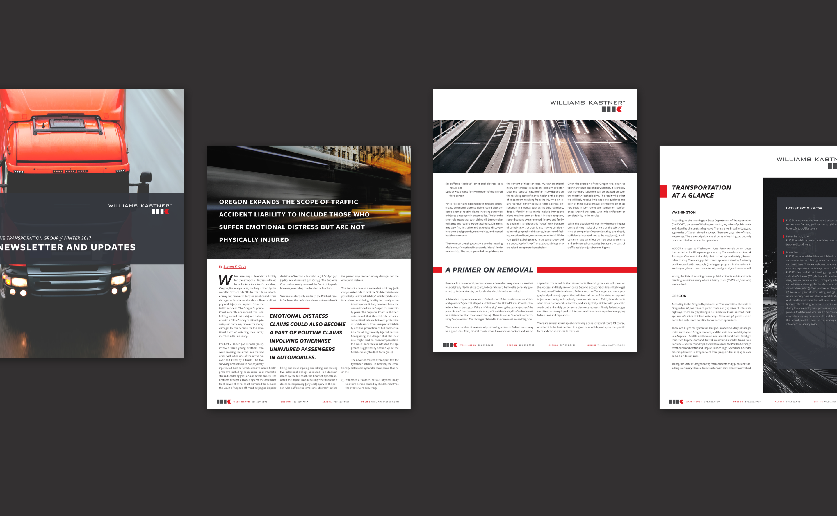
Transportation law update newsletter

Newsletter Design

Wildern came to be very familiar with the Williams Kastner brand for a year before moving into the digital space. We were their primary resource for designing their newsletters and creating branded brochures for each newsletter type: transportation, surety, insurance, and quarterly. They were impressed with our ability to distill complex and long format articles into easily digestible newsletters and when the budget and time came for a website redesign – we were hired.

Digital inspiration board

Digital Brand Refresh

In an effort to modernize and elevate Williams Kastner’s previous brand, I created a digital styleboard to showcase what their brand could look and feel like digitally. Mixing elements of cool Pacific Northwest photography along with the high contrast in their color palette, we bridged together their service to the Pacific Northwest with their high-quality professionalism. The bold red overlay and dark charcoal along with the soft and slightly desaturated photography was our modern take on law firm branding.

Sitemap

Rethinking the Content

Williams Kastner came to Wildern with a need to rethink their content – with forward-thinking hero sections, location-specific pages and ways to contact, easily navigable practice area overview page, an organizational system for all of their post-type (articles, press releases, events, newsletters), and a means to easily search and find lawyers, their bios, and the articles they’ve written. The content’s infrastructure needed to be flexible for a large variety of content, specifically in terms of length, i.e. article title lengths for post types.

The clip below outlines the location-specific pages. Both locations are built on one page, with the ability to easily navigate between the two trough a secondary navigation. Once the location is selected, the corresponding location-specific contact information, news and events, as well as lawyers is populated below.
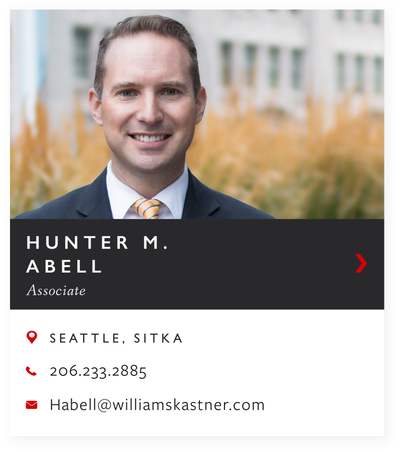
Card Design

The first notable bit of organized content is the attorney card I designed, adding attorney visibility and searchability. A card was the most sensible design solution to organize the multiple content types into one easily digestible section: image, name, position, location, and contact. This allows for a quick overview of information, allows the user to view the information in its entirety, and creates equal hierarchy between all lawyers. Excessive borders were avoided in order to reduce distractions and visual hierarchy was implemented to highlight the main action: bring the user to the attorney bio page. The user is also able to directly contact the lawyer from the card and visit the locations page.

Search + Filter Tool

Next up is the incredibly powerful search and filter tool. This search and filter menu was applied to both the lawyers as well as on the news and insights page. The universal filters applied on the attorneys’ page are location, position, bar admission, and practice area. Allowing multiple selections lets the user narrow down their search quickly and comfortably by removing lawyers from view until there are no results – in which case the user can easily clear the applied filters. Displaying applied filters was also important, in both its original positions as well as a separate section allowing the user to quickly check the status of their filters and deselect if necessary.

News + Insights Page

I created a highly customized news and insights section that catered to the needs of Williams Kastner’s diversity of content. The typographical system and post types were designed to reflect an editorial feel as well as support a variety of content lengths – as attorney articles tend to have lengthy titles.

In order to break up the density of the news and insights page, I created numerous featured posts styles: the header featured post, the article featured post, and the event featured post. Because image curation was not something WK was proficient at or had the time for, these posts stick until a newer post is published. From this page, the user is able to view all news and insights, view all articles, view all events, or view all news.


Blog Post Template

The blog posts were designed to support two types of posts: articles and events. The articles support a featured image if available, links to the attorney bio pages via author thumbnails, a pull quote style, and related articles based on the author of the article. The event post type adds further functionality with the event information module, an attorney speakers section, and lastly an added header style to easily break up the content.

This was all created to give Williams Kastner the flexibility they needed to showcase its content in the most suitable format. Attorneys are able to showcase the articles they’ve published on their attorney pages, a user can come to the WK website and read all articles written by one attorney, and users and attorneys alike can easily search and share this content.

dev styleguide

Development Style Guide

In order to streamline our development process, I created a style guide for our development team. This made our process more efficient and reduced the amount of back and forth with questions like: what is your grid? how does this scale? what happens with error states? how does this work? This process encouraged consistency with our vision and also allowed the development team to focus on building the most efficient custom site.

Reflection

Moving forward, I hope Williams Kastner invests the time and money into a custom site-wide search. The added functionality of this search would give the customer as well as the attorneys the ability to use their law firm’s website as an even more robust tool. Weighted search, with attorneys weighted the strongest, would give the user more power and ability to narrow down their search more quickly.

In reflection, navigating satisfying the needs of many highly intelligent, technical people was a great challenge with this project. There were weeks of highly technical revisions and custom requests involved in order to launch, along with a lengthy client wordpress training process. We as an agency learned a lot about the design to development workflow through this project — we began implementing Trello as a communication tool between designer and developer, the development team implemented rules and expectations around dev style guides, and we set out to solve how to best communicate a website’s structure through the implementation of a components dev guide.


Top